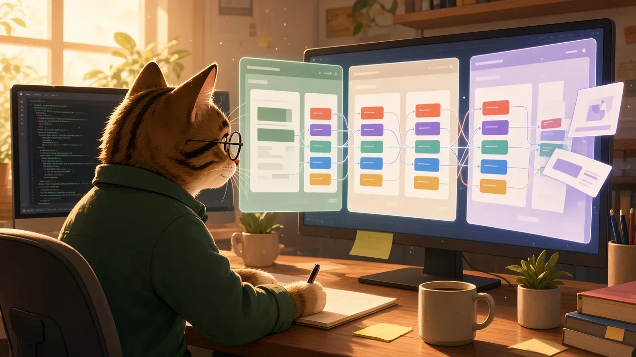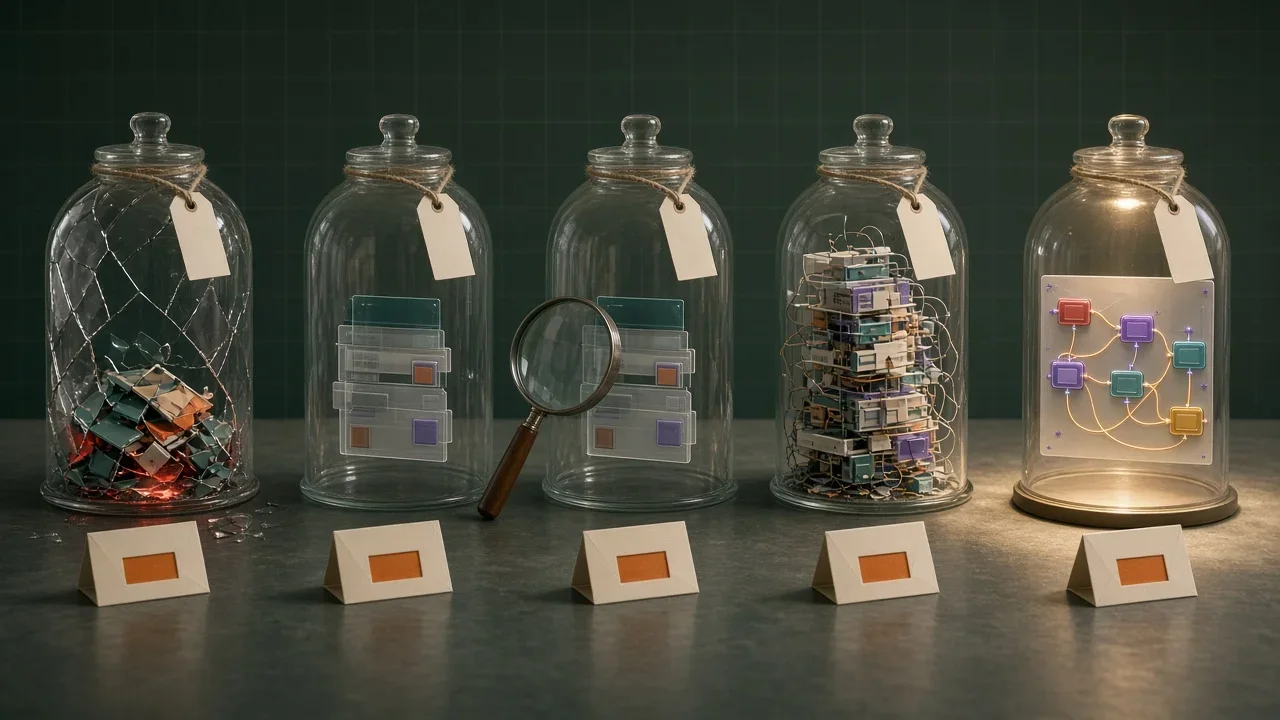

The Design Corner: Where Good Ideas Go to Get Misunderstood
Design work does not fail only because the mockup is wrong. It fails when intent, states, constraints, accessibility, and ownership disappear between product, design, engineering, and QA.
Good ideas do not usually die all at once.
They get misunderstood a little at a time.
The product idea makes sense in the meeting. The design looks strong in the review. The engineering estimate seems reasonable. Everyone nods. Screens get approved. Tickets get created. The work moves forward.
Then development starts, and suddenly the neat idea has sharp edges.
What happens when the user has no data?
What does the error state look like?
Is this button disabled, hidden, or still clickable?
What happens on mobile?
What if the user does not have permission?
What if the API is slow?
Who wrote the copy?
Does this meet accessibility expectations, or are we planning to discover that later in a more expensive way?
This is where good ideas go to get misunderstood: the space between intention and implementation.
Design is not just how something looks.
Design is how the team explains what should happen.
The Mockup Is Not the Whole Story
A polished mockup can hide a lot.
It shows the happy path. It shows the ideal data. It shows the screen after everyone has made the right choices in the right order with the right permissions and a stable internet connection.
That is useful.
It is also incomplete.
A team needs more than the sunny-day version of the interface. It needs the weather report.
Before a design is ready to build, the team should understand:
- Empty states
- Loading states
- Error states
- Disabled states
- Permission differences
- Validation behavior
- Mobile and responsive behavior
- Keyboard and screen reader expectations
- Long content, missing content, and weird content
- What happens before and after the screen shown in the mockup
If those things are not discussed, they do not disappear.
They just become surprise decisions during development.
And surprise decisions during development are where consistency goes to quietly suffer.
Handoff Is Usually Too Late
Design handoff is often treated like a ceremonial passing of the file.
Design says, "Here are the screens."
Engineering says, "Cool, we will build them."
Then everyone pretends the hard part is done.
It is not.
If engineering sees the design for the first time at handoff, the team has waited too long.
By then, the structure may be harder than expected. The design might depend on data that does not exist. The interaction might fight the existing component system. The responsive behavior might be unclear. Accessibility might require changes that feel annoying only because they were considered too late.
The better version is not handoff.
It is overlap.
Engineering should see early concepts. Design should hear technical constraints early. Product should explain what must be true for the work to matter. QA should raise the weird paths before the sprint is already full.
That does not slow the work down.
It prevents the team from sprinting confidently toward rework.
Design Intent Needs to Be Written Down
Sometimes the design is right, but the intent is invisible.
The screen says what goes where. It does not always say why.
That matters because implementation is full of tiny judgment calls. If the engineer understands the intent, they can make better decisions when reality refuses to match the mockup.
Design intent can be simple:
- This page should help the user recover from a failed payment without contacting support
- This flow should reduce the number of choices before the user understands the consequences
- This dashboard should help a manager spot exceptions, not monitor every detail
- This empty state should teach the user what to do next, not just say nothing is here
- This warning should slow the user down because the action is destructive
That kind of context changes the build.
It helps the team protect the purpose of the design instead of worshiping the pixels.
Pixels matter.
Purpose matters more.
The Component System Has Opinions
Every product has a design system, even if nobody admits it.
Sometimes it is documented, named, versioned, and cared for.
Sometimes it is just five different buttons, three modal patterns, and a form field that everyone is afraid to touch.
Either way, the system has opinions.
When a new design ignores the existing system, the team has to decide whether the new pattern is worth the cost.
That cost includes:
- Build time
- Testing time
- Accessibility review
- Future maintenance
- Visual consistency
- Documentation
- Whether the pattern will be reused or become a one-off
One-offs are not always bad.
But accidental one-offs are expensive.
If a design needs a new component or interaction pattern, name that decision clearly. Do not smuggle it into the sprint as "just a slightly different card."
It is never just a slightly different card.
Copy Is Part of the Interface
Teams love to leave copy until the end.
This is how products end up with buttons that say "Submit," errors that say "Something went wrong," and empty states that sound like the product is disappointed in the user.
Copy is not filler.
Copy tells the user where they are, what happened, what they can do, and whether they should be worried.
Design reviews should include copy questions:
- Does the user know what action they are taking?
- Does the error explain what happened and what to do next?
- Does the empty state help or just announce emptiness?
- Does the confirmation message match the consequence?
- Does the language match how users actually talk about the thing?
Bad copy creates support tickets.
Good copy quietly prevents them.
Accessibility Is Not a Polish Pass
Accessibility cannot be something the team sprinkles on after the design is already built.
It affects structure, interaction, copy, state, focus, color, motion, and how information is communicated.
If accessibility comes late, it will be treated like an interruption.
If it comes early, it becomes part of the design.
The basics should be boring:
- Can this be used with a keyboard?
- Is focus visible and logical?
- Is the color contrast readable?
- Are errors announced and connected to the right fields?
- Does the interaction depend only on hover?
- Does motion respect reduced-motion preferences?
- Does the layout still make sense when text gets longer?
- Does the screen reader order match the visual meaning?
These are not edge cases.
They are product quality.
And product quality is not a nice-to-have unless the team is comfortable saying some users matter less.
Design QA Is Not Nitpicking
Design QA gets a bad reputation because people confuse precision with fussiness.
Yes, some differences do not matter.
But some do.
Spacing can affect scanability. Hierarchy can affect comprehension. Missing focus states can block keyboard users. A subtle copy change can alter the meaning of a choice. A loading state can be the difference between trust and repeated clicks.
Design QA should not be about making engineers feel like they failed a pixel exam.
It should be about checking whether the built experience still carries the intended behavior, clarity, and quality.
Useful design QA asks:
- Does the page still communicate the right priority?
- Does the interaction behave the way users will expect?
- Did any state get invented during development without review?
- Did responsive behavior change the meaning or usefulness of the layout?
- Are the accessibility basics intact?
- Does the built version still solve the problem?
That is not nitpicking.
That is finishing the work.
The Best Design Reviews Are Cross-Functional
A design review should not be a performance.
It should be a working session.
Product brings the goal and trade-offs.
Design brings the interaction, structure, and user experience.
Engineering brings feasibility, system constraints, and implementation risk.
QA brings edge cases, regressions, and places the product has lied before.
Support or customer-facing teams bring the patterns users actually struggle with.
When those perspectives show up early, the design gets stronger.
When they show up late, they become objections.
That is the difference between collaboration and surprise.
A Better Design Readiness Checklist
Before design is considered ready for development, ask:
- What problem does this design solve?
- What is the primary user action?
- What states are missing from the mockup?
- What content can be long, empty, missing, or weird?
- What permissions or user roles change the experience?
- What components already exist?
- What new patterns are being introduced?
- What accessibility requirements affect the interaction?
- What should happen if the system is slow or fails?
- What does QA need to know before testing?
- What should support or customer-facing teams know before release?
If the team cannot answer those questions, the design may still be good.
It just may not be ready.
That distinction saves everyone pain.
Protect the Idea, Not the Artifact
The artifact is the mockup, the prototype, the ticket, the spec, the comment thread.
The idea is what the team is trying to make true for the user.
When teams protect the artifact too tightly, they fight over whether the build matches the file.
When teams protect the idea, they ask whether the product still solves the problem.
That is the healthier conversation.
Sometimes the design should change because engineering found a simpler path.
Sometimes the build should change because the implementation lost the point.
Sometimes the scope should change because the team finally understood the edge cases.
That is not failure.
That is the work becoming real.
The Design Corner is not where pretty screens sit.
It is where product intent, user needs, technical constraints, accessibility, and quality have to meet without pretending they are separate.
Good ideas deserve that kind of care.
Otherwise they do not fail dramatically.
They just get misunderstood, one missing state at a time.
Continue Exploring
View All